
Choosing the Right Fonts for Business Signage
Your physical branding serves as a silent salesperson for your local Texas business establishment. Choosing effective signage fonts ensures that your brand message reaches every potential passing customer. Clear typography creates an immediate professional impression while building trust with your target audience.
Visual communication requires a careful balance between artistic style and practical everyday functional utility. Proper font selection helps your company stand out within a crowded local commercial marketplace. High-impact designs reinforce your unique brand identity across various physical advertising platforms used today.
The Vital Importance of Clear Readability
Legibility stands as the most critical factor when selecting your business display lettering styles. Similarly, simple typefaces allow drivers and pedestrians to process your message within a few seconds. Clean lines ensure that your company name remains visible from very long distances away.
The surrounding environment significantly impacts how people perceive your chosen signage fonts during travel. Natural sunlight or harsh street lamps can change how letters appear to the eye. You must choose styles that maintain their structural integrity under various difficult lighting conditions.
Additionally, testing your designs at different scales helps prevent common visibility issues for your building. Distance viewing requires thick strokes and wide apertures to remain effective for passing traffic. Most successful brands prioritize clarity over artistic flair to ensure their message lands perfectly.
Matching Signage Fonts to Your Brand Identity
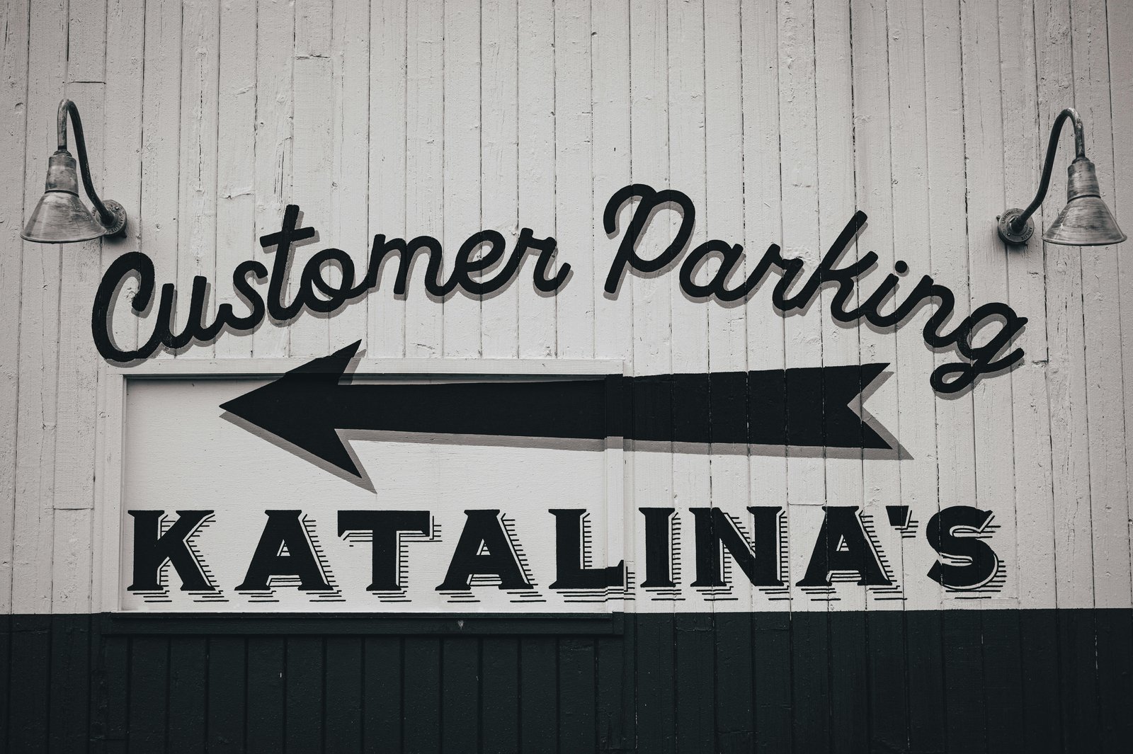
Your typography choices communicate specific personality traits about your professional business to the public. For instance, bold sans-serif styles often project a modern feeling of innovation and technological corporate strength. Conversely, traditional serif lettering suggests a sense of established reliability and classic elegant sophistication.
In addition, consistency across all physical touchpoints strengthens your market presence within the local Dallas area. Using the same signage fonts on vehicles and storefronts creates a unified visual experience. This repetition helps customers remember your business when they need your specific expert services.
As a result, modern consumers quickly judge a business based on the quality of its external visual. Poorly chosen lettering can make an expert service provider look amateurish or completely unreliable. Investing in high-quality typography demonstrates that you value precision and professional attention to detail.
Critical Size and Spacing for Signage Fonts
Proper measurements ensure your message remains clear to anyone walking or driving past today. Specifically, expert guidance helps determine the ideal scale for your specific location and building size. Achieving the correct balance is essential for making a strong and professional first impression.
The following list outlines key technical requirements for creating high-impact and legible business displays:
Height Requirements: Letter scale depends heavily on the intended viewing distance of the sign.
The Rule of Ten: Experts suggest one inch of height for every ten feet of distance.
Capitalization: Standard capital letters generally provide better visibility than lowercase characters for outdoor signs.
White Space: Utilizing wide margins around your text prevents the layout from appearing cluttered.
Alignment: Consistent vertical alignment creates a professional look that enhances the overall architectural design.
A FedEx Office survey found that nearly 76% of consumers enter a store they’ve never visited before because of its signage, and many also report making purchases based on what they see. Proper sizing, clear fonts, and well-structured layouts help capture this high in-store traffic potential while guiding attention to key details like contact information.
Maximizing Contrast and Visual Visibility
High contrast between your lettering and the background surface significantly improves overall reading speed. For example, dark text on a light background remains a classic choice for maximum visual impact. Selecting the right color palette ensures your signage fonts pop in any outdoor environment.
Moreover, the physical texture of your building surface can also affect how colors appear outdoors. Glossy finishes might create distracting reflections that obscure your important business contact details information. Matte materials provide a stable surface that enhances the clarity of your printed graphics.
In the same way, environmental factors like weather and seasonal changes impact how people see your storefront display. Your chosen signage fonts must perform well during rainy days and bright summer afternoons. Quality materials ensure that your colors remain vibrant and readable for many years ahead.
Technical Guidance for Signage Fonts Selection
Specialized design tools allow for precise adjustments to the weight and slant of lettering. Experienced consultants evaluate how different materials reflect light to maintain high levels of clarity. Every technical adjustment aims to improve how the general public perceives your professional brand.
Data from the U.S. Small Business Administration shows that effective signage is a low-cost way to attract customers and increase store traffic. Well-designed signs improve visibility and quickly communicate key information to passersby. Strategic placement and clear fonts help turn attention into consistent daily visits.
To illustrate, digital printing technology allows for extremely detailed and sharp edges on every single character. Modern fabrication processes ensure that your custom colors match your existing brand standards perfectly. High-quality production values contribute to the long-term durability of your exterior signage assets.
Strategic Expertise Behind Every Design Choice
Our experienced team provides comprehensive design support to help you navigate complex typography choices. Therefore, we analyze your specific location to determine which signage fonts will perform the best. Every recommendation focuses on balancing your unique brand style with essential real-world functional requirements.
We handle everything from initial site surveys to the final expert installation of signs. Our consultants explain how different materials affect the appearance of your chosen brand lettering. We provide detailed digital proofs so you can see the results before production begins.
Our local company serves businesses in Wylie, Plano, Garland, Richardson, Allen, Rowlett, and Dallas. We understand local zoning laws and permitting requirements for all types of outdoor signage. Our commitment to quality ensures that your business stands out for all the right reasons.
Elevate Your Presence With Expert Design
Effective communication starts with a clear and professional visual presence in your local community. Following this, choosing appropriate branding elements is a fundamental step toward building a recognizable and trusted brand. Your business deserves a high-quality solution that reflects your dedication to excellence and service.
Signsmiths of Texas provides professional expertise to develop impactful visual solutions that drive real results. We invite you to call our specialist team to discuss your specific signage fonts today. Our knowledgeable staff is ready to provide guidance for a successful installation; contact us today.