
CMYK vs. RGB vs. the Visual Spectrum: Why Printed Signs Look Different
Professional branding requires consistency across all platforms to build trust with local customers. Choosing the right CMYK vs. RGB printing settings ensures your physical signs match screens. High-impact visual communication depends on understanding how different color models behave in production.
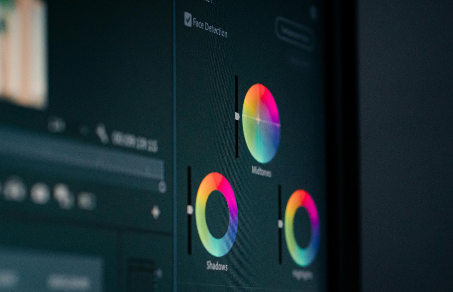
Modern displays use light to create the vivid images you see on mobile devices. Most digital files naturally utilize the RGB spectrum to achieve bright and saturated tones. Consequently, many designers struggle when CMYK vs. RGB printing differences alter their final results. Proper preparation remains the most effective way to maintain professional standards for your brand.
What Is RGB?
Screens generate colors by mixing red, green, and blue light at various intensities. Computers and smartphones use this additive process to produce millions of distinct, glowing shades. Digital designs often look much brighter because the screen provides its own internal illumination.
Pixels on your monitor display light directly into your eyes for vivid experiences. Most web-based graphics rely on this format to maintain high contrast and saturation. However, problems arise when you attempt to use CMYK vs. RGB printing for signage. Light-based colors possess a much wider gamut than what physical ink can provide.
Digital files for social media or websites should always remain in this format. Using the wrong profile during the initial design phase can lead to unexpected shifts. Clients often notice that neon or electric shades lose their glow on physical materials. Proper preparation ensures that your brand remains recognizable across every single digital marketing channel.

CMYK vs. RGB Printing: Defining the Physical Model
Physical printing utilizes a subtractive process involving cyan, magenta, yellow, and black. These four colors combine on surfaces like vinyl or metal to create various shades. Unlike screens, paper and plastic do not emit light to produce their visual effects.
Moreover, printers layer these specific inks to absorb certain wavelengths from the surrounding environment. The "K" in the acronym stands for key, which refers to the black plate. Most professional print shops require files in this format to ensure accurate color layering. Data suggests that consistent brand presentation can increase business revenue by 23%
Knowing the limitations of physical ink prevents disappointment during the final installation phase. Using CMYK vs. RGB printing knowledge helps designers manage expectations for finished outdoor signs. Transitioning your design files early helps bridge the gap between digital concepts and tangible products.
Why Colors Look Different in Print
Essentially, the fundamental difference lies in how our eyes perceive light versus reflected pigment. Screens shine light outward, while a printed banner reflects the ambient light around it. This natural physics gap makes CMYK vs. RGB printing a common challenge for businesses. Many vibrant digital tones fall outside the printable range of standard commercial ink sets.
Additionally, material texture also influences how a finished sign looks in different weather conditions. A glossy vehicle wrap reflects light differently than a matte-finished interior lobby sign. These environmental factors often change how a specific color appears to the human eye. Industry data suggests that color management is vital for high-quality production.
Therefore, software attempts to simulate print colors, but digital previews are rarely perfectly accurate. Mastering CMYK vs. RGB printing nuances helps minimize these discrepancies so brand colors stay acceptable. Proper planning ensures that your physical signage looks professional and matches your marketing goals.
How to Prepare Files for CMYK vs. RGB Printing
Setting up your design files correctly from the start saves significant time. Accurate file preparation is the most effective way to handle color transitions during production. Consulting with an expert ensures your technical specifications meet the specific requirements of hardware.
Follow these professional guidelines to ensure your brand colors remain consistent on every sign:
Select standardized color codes like Pantone for the most accurate brand matching possible.
Use high-resolution images to prevent blurring or pixelation on large-scale banners.
Check that your design software is set to the CMYK color space initially.
Convert all text to outlines to avoid font errors during the production process.
Review a physical color proof before authorizing the full production of your signs.
Small adjustments during the design phase lead to much better outcomes for your business. Understanding CMYK vs. RGB printing ensures quality results depend on attention to prior detail.
How Professionals Ensure Total Color Accuracy
Advanced printers require regular calibration to maintain consistency across different material batches. Technicians monitor ink levels and print heads to prevent any streaking or color drifting. Every material reacts differently to ink, requiring unique profiles for vinyl, mesh, or metal.
Besides technical checks, professional designers review every file to catch issues before printing starts. They adjust saturation and contrast to compensate for the natural absorption of the material. This proactive approach helps businesses avoid costly mistakes and delays in their marketing schedules.
Custom signage solutions require a collaborative approach between the business owner and manufacturer. Addressing CMYK vs. RGB printing requirements helps the production team choose the best available methods. Every project receives individual attention to ensure the final product meets your exact standards.

Real-World Applications for CMYK vs. RGB Printing
For instance, businesses in Rowlett and Richardson require signage that maintains integrity outdoors. High-impact vinyl wraps must match the colors seen on corporate websites and ads. Following proper CMYK vs. RGB printing protocols ensures that your fleet looks perfectly uniform.
Interior environments like lobbies and offices also benefit from precise color matching. Wall graphics and 3D signs must reflect the professional standards of your specific industry. Maintaining these visual details creates a cohesive experience for customers visiting your physical location.
In summary, strategic color use impacts how customers feel when they interact with you. Warm or bold tones can drive engagement and make your business feel more welcoming. Successfully navigating CMYK vs. RGB printing transitions is vital for any growing local company.
Vibrant Branding Success: Partner With Experts for Perfect Results
In conclusion, local businesses in Wylie and Plano deserve signage that represents them with precision. High-impact visual communication starts with choosing a partner who understands complex technical details. Precise color reproduction is essential for maintaining a professional image in the Dallas market.
The team at Signsmiths of Texas provides comprehensive support from design to installation. They understand how CMYK vs. RGB printing impacts the final look of your signs. Contact us today to discuss your project and ensure your colors match.