Understanding Colors in Sign Design: How Color Choices Impact Visibility
Creating a powerful brand presence requires more than just a logo or a name. Choosing the right sign colors allows your business to capture attention and communicate values instantly. High-impact visual communication relies on strategic palettes that work across various lighting and environments.
Every local business needs a distinct identity to thrive within the competitive Dallas market. Poorly selected shades often lead to missed opportunities and decreased foot traffic for storefronts. Investing in professional design ensures your message remains clear and professional to every viewer.
The Psychology Behind Your Sign Colors
Vibrant red tones frequently stimulate excitement and urgency for retail sales or emergency notices. Blue shades typically project a sense of stability and professional trust to potential customers. Consequently, strategic color application helps set the emotional tone before a client enters your building.
Warm yellows often create a friendly atmosphere that welcomes visitors into a creative space. Conversely, deep forest greens suggest growth and health for medical or wellness oriented businesses. Selecting the perfect palette requires a deep understanding of human behavior and local expectations.
Meaningful associations between colors and emotions directly influence how people perceive your brand daily. Visual stimuli and psychological triggers significantly impact subconscious decision making. Ultimately, harmonizing these sensory elements ensures your brand message resonates deeply with the target audience.

Contrast and Visibility for Maximum Impact
Reading a sign should be effortless for drivers moving quickly through heavy traffic. High contrast ratios ensure that your text remains legible from a far greater distance. Therefore, dark lettering placed against a light background usually provides the best clarity for viewers.
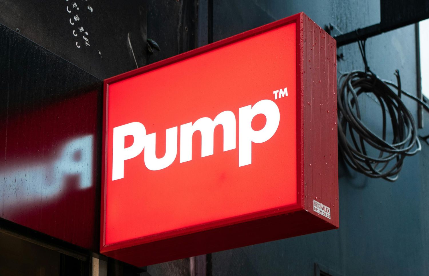
Yellow and black combinations are statistically proven to offer the highest level of visibility. Avoid using similar shades for both text and backgrounds to prevent visual blending issues. Specifically, crisp edges and bold color separation help your business stand out against busy streets.
In addition, visibility is a critical factor for any physical advertisement or permanent storefront fixture. Choosing high contrast combinations improves recall by 38 percent. Selecting high contrast sign colors saves time and prevents frustration for your valued clients.
Environmental Factors That Affect Sign Colors
Outdoor lighting conditions change throughout the day and shift the appearance of your signage. Bright afternoon sunlight can wash out pale colors and reduce the overall visual impact. Shadows from nearby trees or buildings might obscure darker palettes during the early morning.
Artificial street lighting at night also alters how people perceive your specific brand colors. Certain pigments may fade faster when exposed to the harsh Texas sun over time. As a result, durable materials and UV resistant inks help maintain the integrity of your design.
For instance, surrounding architecture and neighboring businesses provide the backdrop for your physical branding efforts. A sign must contrast with the environment to avoid becoming lost in the landscape. Professional site surveys help determine which sign colors will perform best in your location.
Brand Consistency Through Your Sign Colors
Maintaining the same shades across all marketing platforms builds lasting recognition for your brand. Customers start to associate specific color combinations with your quality of service and products. This visual repetition fosters a sense of reliability and professionalism for any growing business.
Consistent application of your chosen palette prevents confusion when clients visit multiple locations. Every vehicle wrap and lobby sign should match your digital presence and printed materials. This uniformity signals that your company is organized and pays close attention to every detail.
Disjointed color schemes often make a professional operation look cluttered and poorly managed. Protecting your visual identity requires a disciplined approach to every physical branding element produced. Maintaining a uniform presentation across every touchpoint helps build long term trust with your audience.
Strategic Options for Custom Signage
Specifically, selecting the right materials and finishes is just as important as the design itself. Different textures can change how light reflects off your chosen palette and branding. Quality fabrication turns a simple concept into a durable asset for your local business.
To illustrate, careful selection of these elements ensures your signage performs well in its space:
Matte finishes reduce glare from direct sunlight or bright interior overhead office lights.
Glossy coatings make your brand appear more vibrant and saturated for indoor displays.
Reflective vinyl increases nighttime visibility for vehicles traveling along dark or rainy roads.
Translucent materials allow for internal illumination which makes your brand glow at night.
Metallic accents provide a sophisticated look for high end professional or corporate lobby signs.
Hence, expert designers evaluate how different hues interact with your unique building architecture and lighting. Testing designs in real world conditions prevents costly mistakes before the final production begins. Expert guidance ensures that your investment in sign colors yields the highest possible return.

Professional Consultation and Installation
Signage requires a collaborative approach to ensure the final product matches your corporate identity. Expert designers evaluate how different hues interact with your unique building architecture and lighting. Testing designs in real world conditions prevents costly mistakes before the final production begins.
In light of this, expert guidance ensures that your investment yields the highest return. Professionals understand the complex relationship between material durability and the chosen visual aesthetic goals. We analyze every detail to guarantee your sign colors remain effective for many years.
Our local experts serve businesses in Wylie, Plano, Garland, and the Dallas area. The team focuses on creating tailored solutions that truly represent your unique company goals. We handle everything from the initial design to the final professional installation on site.
Elevate Your Brand With Expert Design
Undoubtedly, effective signage acts as a silent salesperson that works for your business every day. Strategic sign colors enhance visibility and ensure your message reaches the right local audience. Investing in quality visual communication is a vital step toward achieving long term growth.
Signsmiths of Texas provides the expertise needed to navigate complex design and permitting requirements. Our consultative approach ensures that your custom signage project is completed correctly the first time. Please call our office at 972-464-2926 to discuss your specific goals and vision.