How to Design a Banner That Gets Attention Fast
Creating a high-impact outdoor display requires strategic planning to capture passing attention. Incorporating proven banner design tips helps local businesses stand out from surrounding traffic. Indeed, a beautiful layout on small computer monitors frequently fails at commercial scales.
Drivers have mere seconds to comprehend your corporate message on busy roads. Therefore, crowded visual elements confuse and force prospective clients to look away. Clear communication ultimately ensures that your physical marketing collateral delivers excellent financial returns.
Executing Bold Contrast and Strategic Banner Design Tips
Roadside marketing assets must deliver their primary message within three seconds or less. Restricting your layout to a single dominant statement successfully maintains focus for motorists. Otherwise, busy displays irritate drivers and fail to generate meaningful responses for companies.
Furthermore, adding too many phone numbers or web addresses disrupts the visual hierarchy. Viewers simply cannot absorb multiple competing items while traveling at high speeds locally. Clean presentations naturally allow your target audience to understand the core offer immediately.
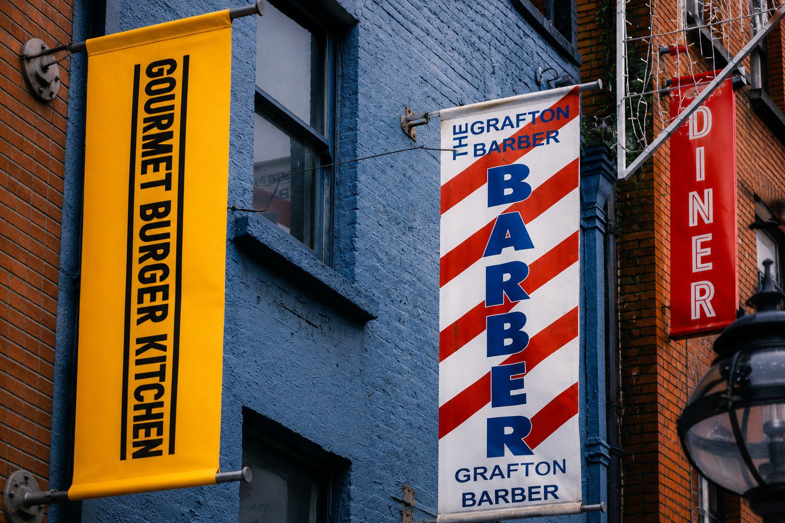
Consequently, successful businesses prioritize clear messaging over complex artistic statements on exterior signage. Filtering out unnecessary text ensures that your brand remains memorable to passersby. Embracing minimalist banner design tips remains the best way to capture local attention.
Selecting Clean Typography to Ensure Distant Legibility
High contrast color pairings ensure your printed text remains legible from a distance. For example, using dark lettering against bright backgrounds creates a powerful visual impact for viewers. Applying smart banner design tips prevents important marketing information from blending.
Business owners should avoid corporate hues that match the building exterior wall. Signs that mimic background landscapes quickly become virtually invisible to regional consumers. Instead, distinctive color choices set your storefront apart from competitors down the street.
Strong saturation preserves clarity when intense Texas sunlight beats down on vinyl. Faded combinations reduce visibility and compromise your corporation's professional image. Selecting appropriate fonts seamlessly guides the human eye directly to critical phone numbers.
Utilizing White Space as an Effective Layout Tool
Bold sans-serif fonts remain crisp even when vehicles travel past rapidly. Heavy lettering holds its form against bright sky backgrounds during daytime hours. Conversely, you should avoid delicate scripts because thin lines disappear entirely at fifty feet away.
Consider these functional options when implementing your custom banner design tips today:
Mesh Fabrics: Wind currents pass through easily without ripping out metal hanging grommets.
Heavy Vinyl: Solid substrates provide rich color reproduction for detailed corporate event displays.
Reinforced Hems: Double-stitched borders prevent tearing when hanging displays between exterior poles.
Matte Finishes: Non-glare materials improve readability when bright afternoon sun hits text.
Protective Coatings: Specialized weather-resistant treatments safeguard inks from fading during hot summers.
Choosing weather-resistant materials guarantees that your display survives unpredictable local weather patterns. Ultimately, consulting with experts saves business owners money by preventing premature product failures.
Essential Banner Design Tips for Material Selection
Leaving forty percent of the printable surface empty naturally elevates your message. This generous breathing room prevents visual clutter from overwhelming your targeted local audience. Open areas effectively guide the eye directly to your specific industry offerings and contact details.
On the other hand, pushing graphic components to margins creates an unorganized look that repels customers. Sophisticated layouts use blank areas to project true brand authority and professionalism. Distributing elements evenly across the sheet ensures a harmonious and legible presentation.
Crowded media looks cheap and diminishes the perceived quality of your services. Giving your content space to breathe significantly enhances retention among busy regional drivers, which is one of the banner design tips. This strategic formatting ensures your custom business signs look exceptionally polished from every viewing angle.
Professional Asset Verification Protects Marketing Budgets
Digital files require careful evaluation before entering the physical production phase successfully. Low-resolution images look terribly distorted when enlarged on large-format outdoor materials. Verification steps easily catch layout mistakes before costly printing errors occur during fabrication.
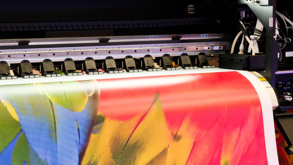
Review these absolutely critical verification steps and banner design tips before starting your next big project:
Graphic Formatting: Ensure all embedded files utilize scalable vector profiles for clarity.
Color Management: Verify that layout palettes match the rules for commercial printing inks.
Spatial Math: Measure the physical mounting area to guarantee correct visual proportions.
Ordinance Checking: Confirm that municipal zoning rules permit your planned structural display dimensions.
Sightline Testing: Evaluate font visibility from multiple distance markers along nearby streets.
Tailored assessments ensure your graphics scale up without losing crisp definition entirely. Experienced specialists evaluate raster vs vector structures to ensure high print resolution during production. In the end, fixing software alignment issues beforehand guarantees a beautiful result for your organization.
Collaborating With Local Experts to Finalize Your Signage
Investing time in technical review processes eliminates project delays for general contractors. Direct collaboration solves subtle design flaws that automated online templates overlook entirely. This professional oversight ensures that your final product perfectly reflects your corporate values.
Transforming ideas into high-impact physical assets requires a deeply collaborative process. Screen layouts require experienced human eyes to ensure accurate real-world performance. Because of this, custom signage requires detailed communication that email simply cannot convey efficiently.
Local business owners achieve superior results by partnering directly with specialized printing technicians. Evaluating your physical installation site parameters ensures the finished display fits safely. Working together closely from the beginning removes stressful guesswork from fabrication schedules.
Custom Banner Design Production Blueprint
Applying professional banner design tips depends on understanding how your target audience moves past your property. Businesses benefit from layout strategies that focus purely on clarity and high contrast. Professional refinement helps ensure lasting marketing results while cleanly showcasing your brand to potential customers.
Trust Signsmith of Texas to transform your initial concepts into an eye-catching custom sign portfolio piece. Do not risk printing an unreadable storefront sign by relying only on digital screens. Call Signsmith of Texas today at (972) 464-2926 to discuss your layout concepts with an expert on our homepage.